World Vision Canada · 2026
Child sponsorship checkout
Sponsoring a child is not a purchase
It is a monthly commitment to a named child, in a named country, for years. Most sponsors stay for the length of a childhood.
At World Vision Canada it was being processed by a page built for buying things.
I redesigned that checkout end to end, from the moment a donor leaves a child's profile to the confirmation screen.
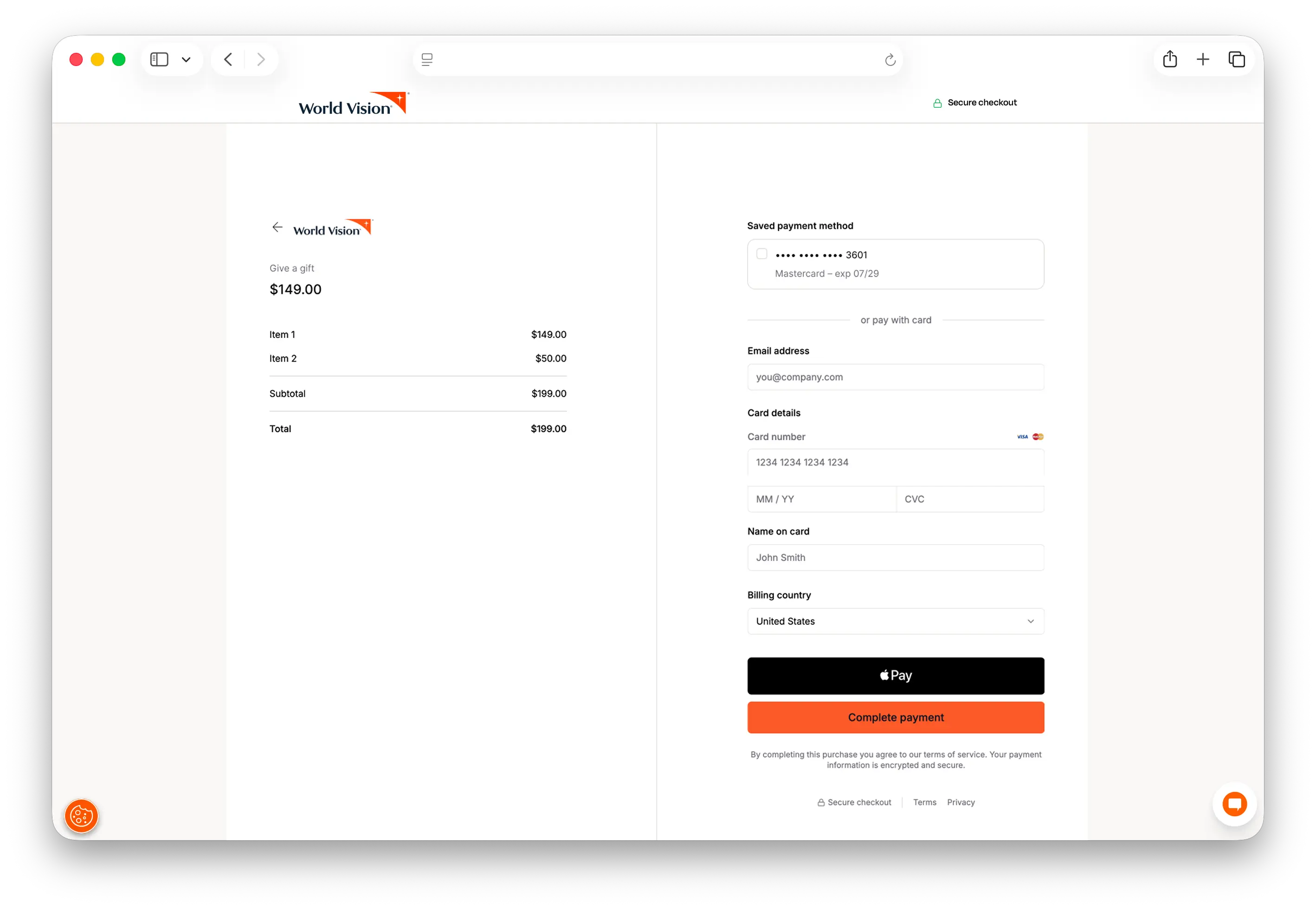
The checkout it replaced was a generic hosted payment page with a logo dropped in. Order summary on the left, card fields on the right, line items and a total. The same page you would use to buy a pair of shoes.
Nothing on it acknowledged what was happening. The child had no name on that screen, no face, no age, no country. There was no difference between a person giving for the first time and a person who had been giving for fifteen years. It treated the payment as the end of something. For a sponsor it is the start.
The result was predictable. A large majority of the people who reached that page did not finish. These were not browsers. They had already read a child's story, seen a face, and chosen. They arrived with the hardest part already done, and then the page asked them to make a payment.
Abandonment gets talked about as friction, and friction is only half of it. People also stop because something goes quiet. The work was not about removing friction. It was about keeping the reason present all the way to the end.
Two people, one page
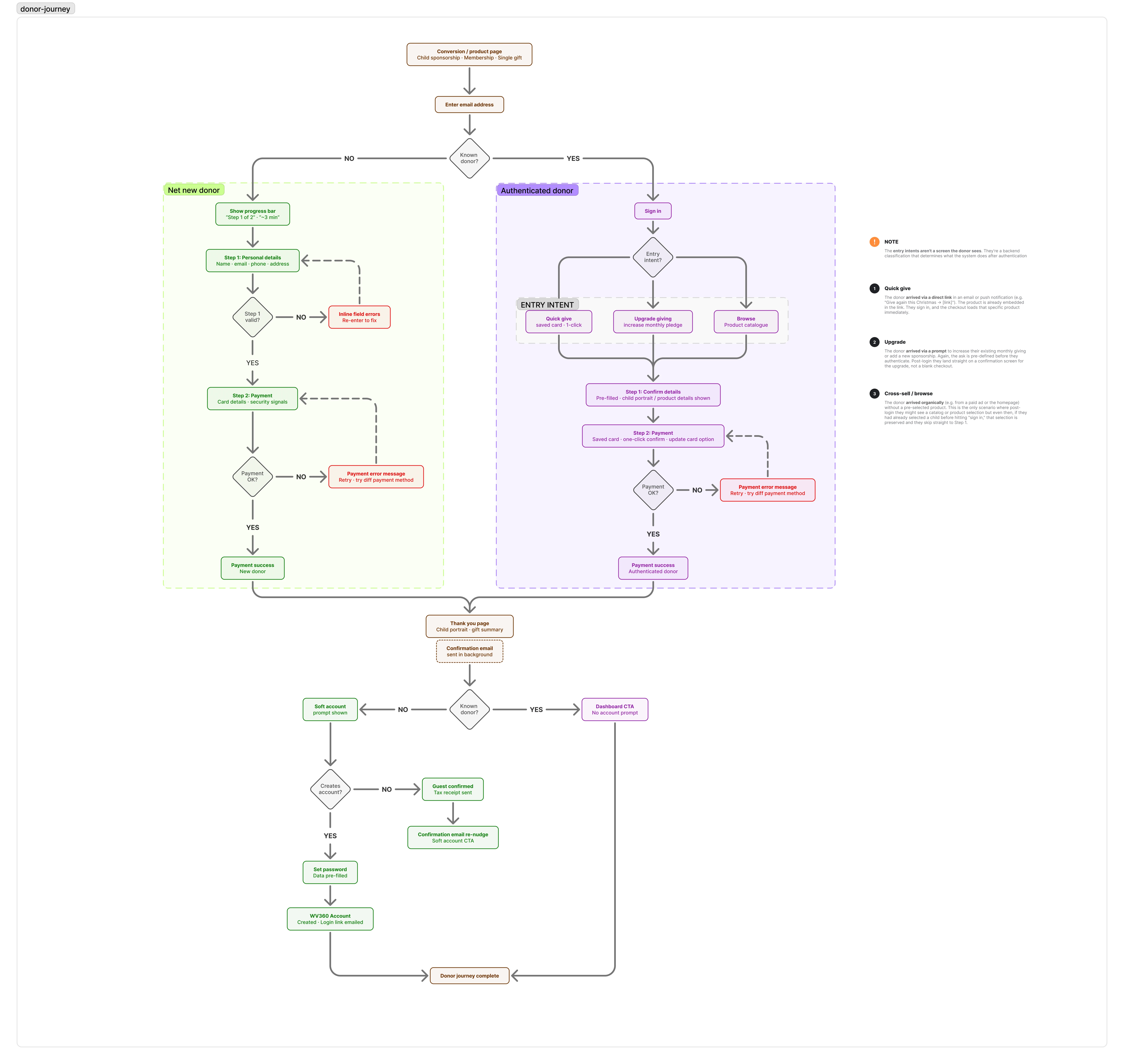
I mapped the journey end to end before designing anything, from the conversion page through to confirmation.
The mapping turned up something the old page had no way to express. There was not one donor arriving at checkout. There were two, and they needed opposite things.
Net new donor
Net new donors arrive cold, usually from a paid campaign. They have been moved by one child's story and are about to commit to a monthly gift for a charity they may not have heard of an hour ago. They need to know this is legitimate, that they understand what they are agreeing to, and that it will not take long.
Returning donor
Existing donors arrive having already made that decision, sometimes years ago. World Vision already holds their details and their payment method. Asking them to prove who they are, then type it all again, treats a fifteen year supporter like a stranger.
One page was trying to serve both. It served neither.
One field at the door
If one page cannot serve both, the page has to know which one it is talking to before it serves anything.
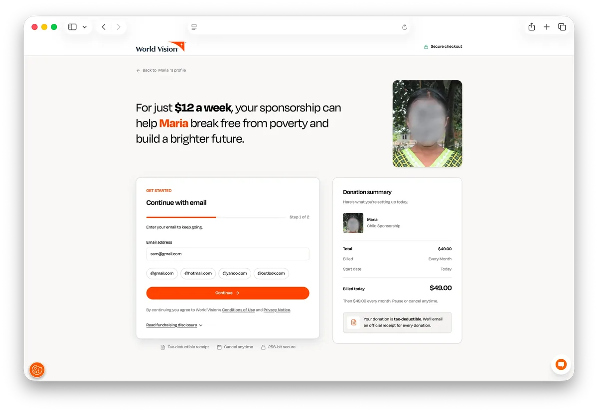
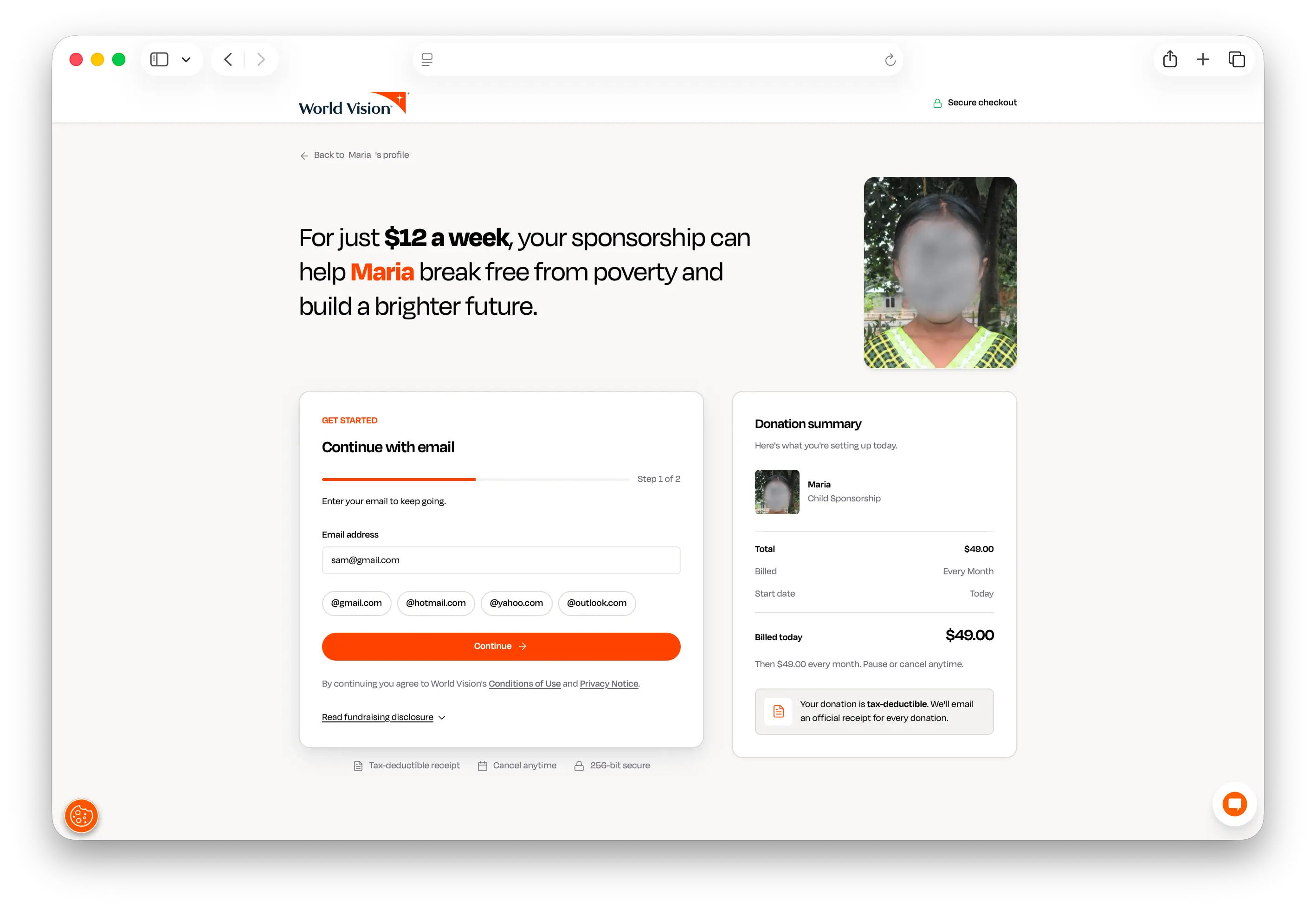
So checkout opens with one question: what is your email address.
The system recognises it or it does not, and that single answer routes the whole journey. New donors continue as guests. Returning donors sign in and meet a checkout that already knows them.
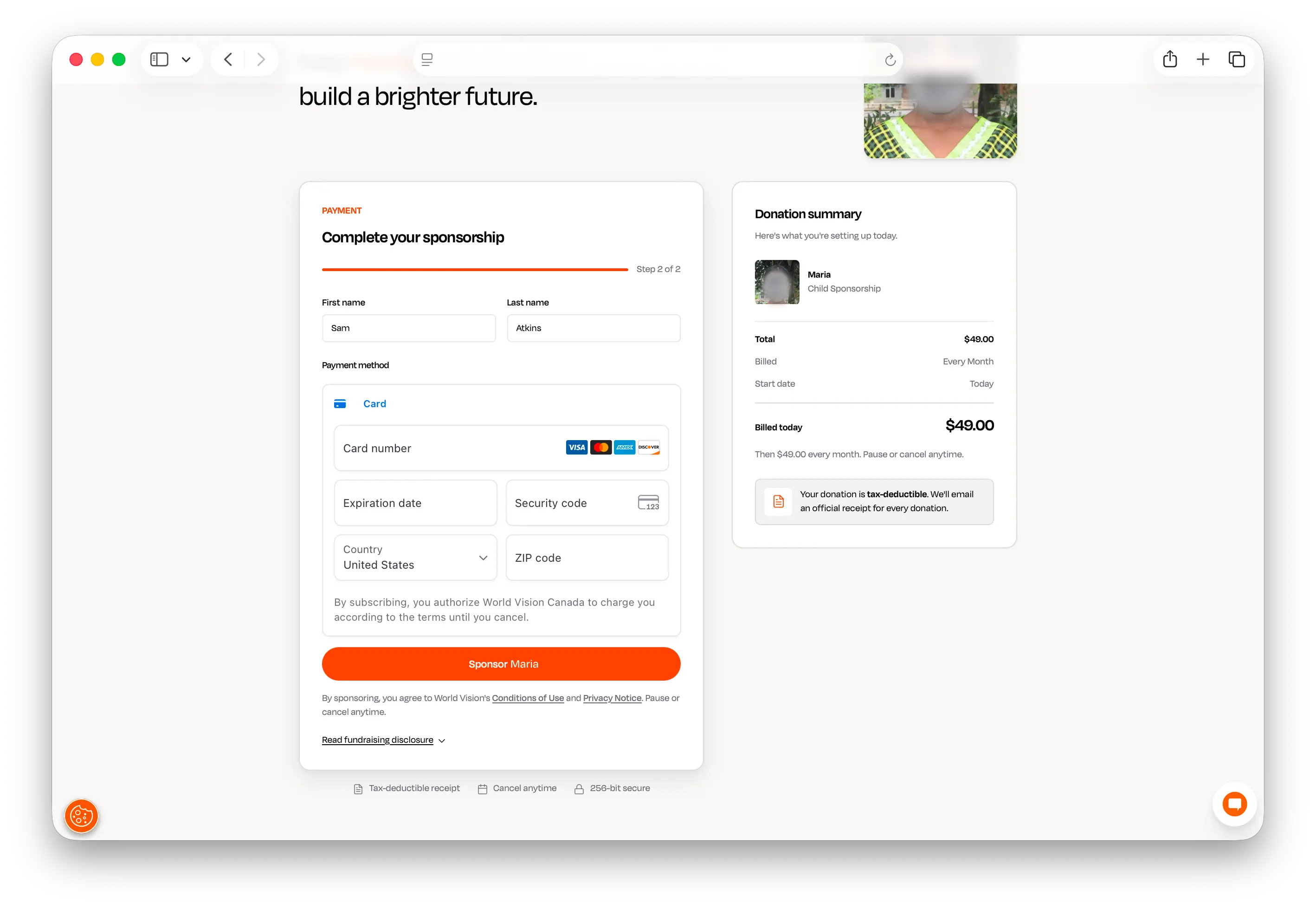
Two steps total. Email, then payment. The progress bar says so from the first screen, because the most useful thing you can tell someone standing in front of a form is how short it is.
Three things made the email the right place to split.
It asks for the only thing the transaction cannot proceed without. A receipt has to go somewhere.
It sorts people without asking them to sort themselves. The alternative is a screen asking whether you already have an account, which a surprising number of people cannot answer, and answering it wrong sends them into a password reset instead of a donation.
Neither path has to compromise. Guest checkout stays genuinely frictionless, because returning donors never see it.
Account creation moved to after payment, framed as an offer rather than a gate. Anyone who declines is finished, and the tax receipt arrives regardless. Asking someone to create an account before they have given is asking for commitment before they have received anything. Asking after they have sponsored Maria is asking whether they would like to follow her progress. Same request, completely different question.
Keeping the reason present
The old page could tell you the amount. It could not tell you who it was for.
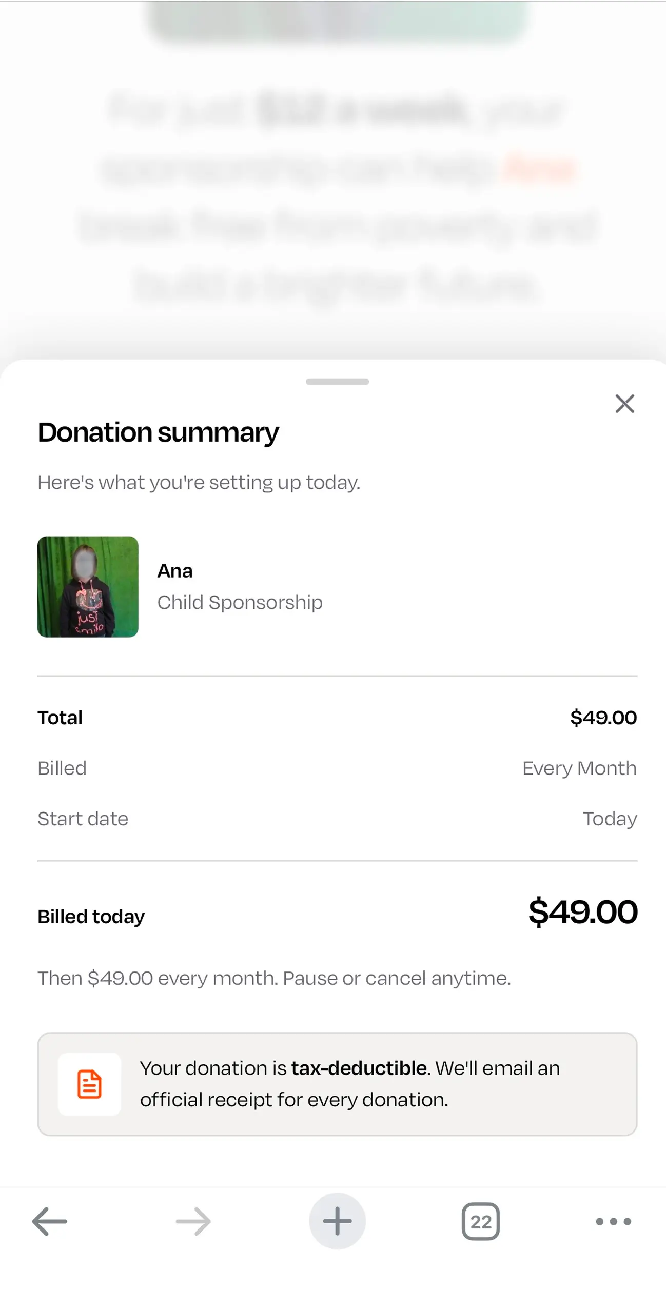
The child is on every screen. Photo, name, age, country, carried from the first screen through payment and into the confirmation, resolved from the child the donor chose. The summary panel holds them beside the total, so at the exact moment someone is entering card details, the thing they are entering them for is six inches away.
This is the part that looks decorative and is not. A form invites second thoughts because a form is silent about why you are filling it in. Keeping the child present means the reason is never further away than the doubt.
The headline does the same work before the form begins. Not "complete your donation" but: for just twelve dollars a week, your sponsorship can help Maria break free from poverty and build a brighter future. The child's name comes before the organisation's, and the person reading it is positioned as the one doing something, not the one being asked for something.
The weekly figure is a reframe, not a discount. Forty nine dollars a month is the commitment and the summary states it plainly, along with the billing date and that it continues monthly. Twelve a week is the same number at the scale people actually assess spending. Nothing is hidden, and both figures are on the same screen.
Doubt arrives with the card
Payment step abandonment is almost always a trust problem, not an intent problem. A donor who made it through step one wants to give.
So the reassurance sits before the fields, not after them. Tax deductible receipt, cancel anytime, encrypted payment. Three lines answering the three doubts that stop someone with their card already in their hand: will I get my receipt, am I locked in, is this safe.
Legal copy moved with them. It used to sit where it read as fine print, which is a strange way to treat sentences whose entire job is reassurance. The fundraising disclosure is present and expandable rather than either buried or shouted.
The pause and cancel language was gated behind privacy sign off before it could be built, which is the correct order for anything that makes a promise about someone's money.
A confirmation that acknowledges what happened
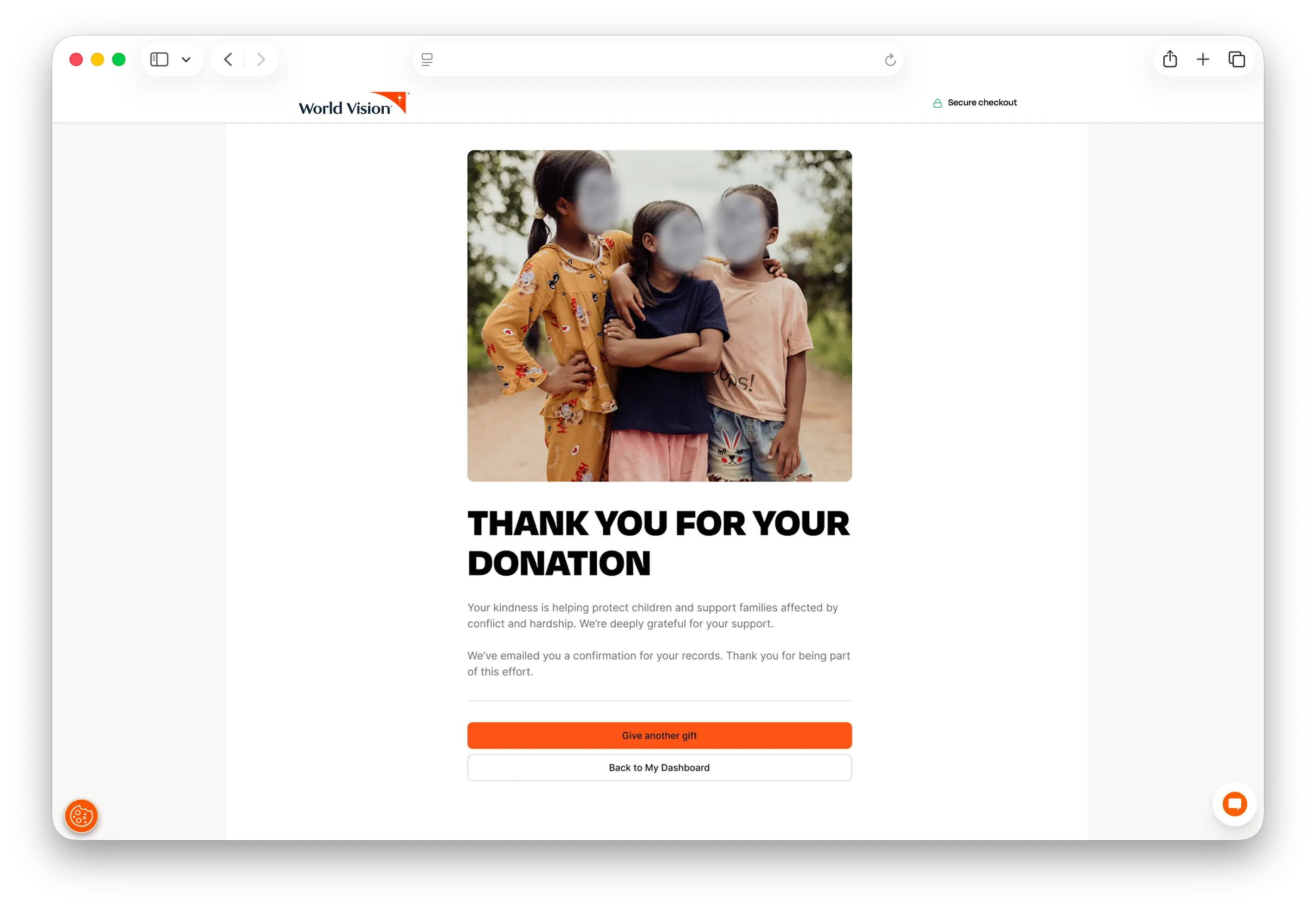
The old thank you page was a stock photo, a generic line about kindness, and two buttons: give another gift, or back to my dashboard.
Someone has just committed to a child for years and is immediately asked to buy something else. The other option assumes they have a dashboard, which a new donor does not.
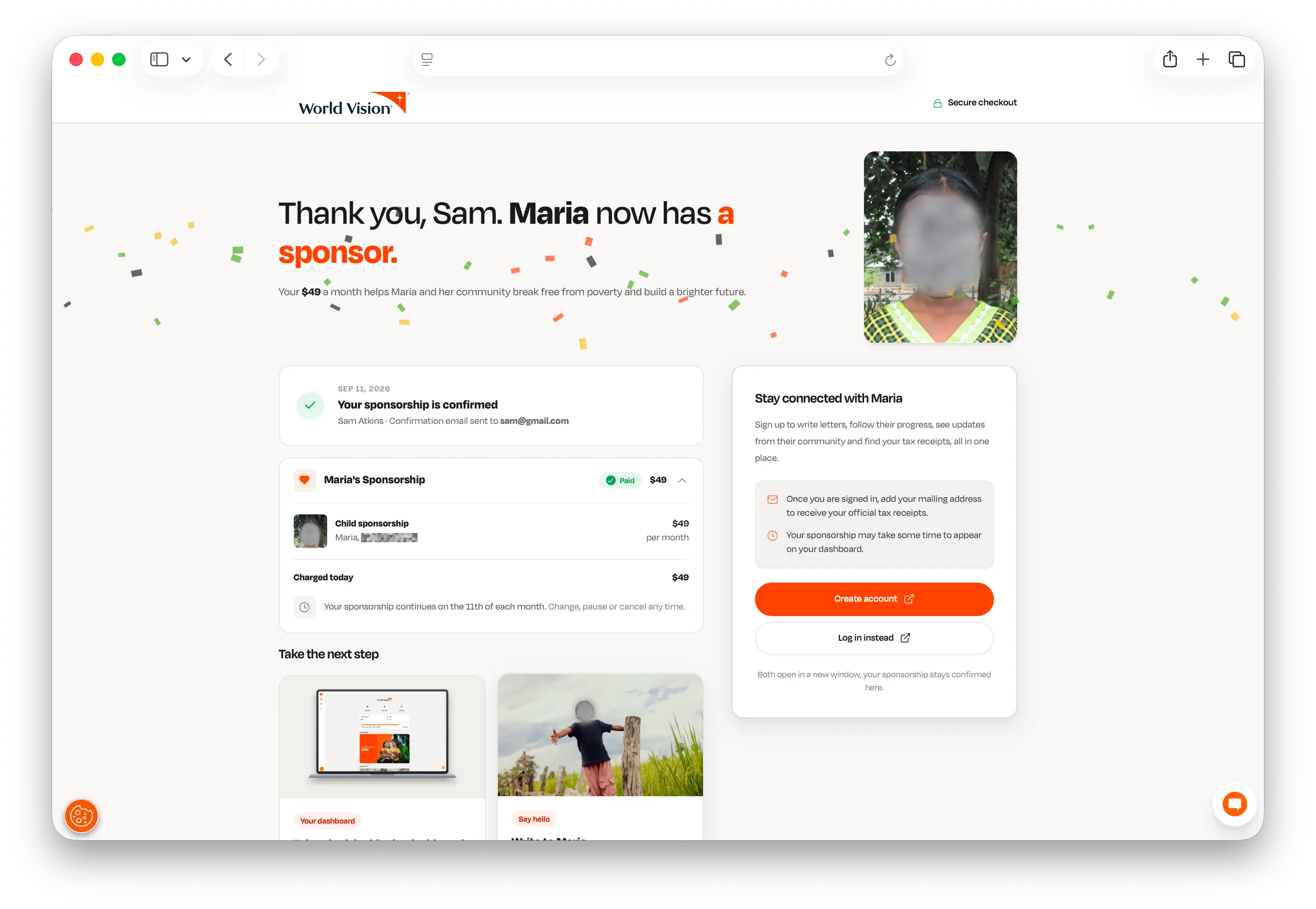
The new page names what happened. Thank you, Sam. Maria now has a sponsor. It confirms the amount, the billing date, the receipt, and where it was sent. Then it offers two things worth doing next: look inside the dashboard, or write to Maria.
Account creation appears here, as the way to follow Maria rather than as an administrative step. It opens in a new window so the confirmation stays put behind it, because nothing about creating an account should risk making someone wonder whether their sponsorship went through.
This page was built by a junior designer working from my Claude Design files and the UI contract. I supervised the delivery.
The problem underneath the problem
The checkout shipped hard coded.
That was the right call for getting it live and it left something exposed. When I handed the designs to developers, there was no shared definition of what anything was. No documented token names, no component contract, no agreed answer to what a card is or which orange is the orange for text. Every design decision had to be explained in conversation, and every explanation was one person's memory against another's.
That is survivable for one checkout. It does not survive four designers.
And four designers were coming. The reason I had built the checkout in Claude Design in the first place was that the directors wanted a faster route from idea to build, and I had volunteered to test whether one existed. It worked. The approval to continue came quickly.
Which is when the actual problem appeared. Generating design faster does not make anything ship faster if the handoff is still a conversation. Speed upstream just produces a larger queue of things nobody can build without asking questions. The bottleneck had moved, and it had moved to the place where design becomes code.
So the next piece of work was not a better tool. It was a contract.
Writing the contract
I wrote the first version of the UI contract: the token layer, the component definitions, the rules about what a page is allowed to do.
The most important decision in it was not a design decision. I matched the token naming to the conventions the developers already used.
It would have been easy to name things the way a designer thinks about them. It would also have guaranteed rejection, because it would have asked an engineering team to adopt a vocabulary that disagreed with the one already in their codebase. A contract that gets rejected on arrival protects nothing.
The rule the contract turns on is that changes are made to tokens or to components, and pages may only compose what already exists. A new class name in a page file is a defect until someone argues for it. That one line is what stops a design system from quietly becoming a folder of suggestions.
The second rule took longer to articulate. Apply the token that means what you are doing, not the one whose output happens to look right. There are several ways to make a button orange and only one of them is correct. A design can pass a visual review and fail at handoff because it references the wrong things underneath, and the failure does not appear until someone changes a value and the wrong things move.
background: var(--action-primary);background: var(--brand-accent);What it enabled
The directors approved the designs, the direction, and the process for designing with AI.
Four designers now work from that base, producing designs for their own teams. The thank you page in this case study was built by a junior designer working from those files and that contract, and it shipped.
What I would do differently
The checkout shipped before the system existed. There was a real reason for it, the launch was what set the timeline, but it means a live surface does not inherit the improvements the system makes. It is queued for porting behind pages where the work is cheaper to prove.
I also wrote a versioning rule and then numbered the first two releases under it by feel. Both added components and should have been minor releases. I had drafted both as patches and renumbered them afterwards. A rule is not worth much if the first two releases under it ignore it.
The contract is not finished, and that is by design. I wrote the first version. It is being completed by the design manager and the director of technology, and the parts that need a decision above my level are marked in it as open rather than settled.